nba_subset <- nba %>%
    mutate(season_int = substr(nba$season, start = 1, stop = 4))  %>%
filter(team_abbreviation %in% c("LAL", "NYK", "GSW"))14 Basic Regression
Important
This chapter makes use of the broom package, part of the tidyverse-adjacent family of packages, tidymodels. It can be installed and loaded in the same way that we have installed/loaded other packages (see Section 1.5 for a refresher).
14.1 Metric-Predicted Variable with One Metric Predictor
Imagine we are interested in the following research question: what factors explain the average number of points scored by a player per game (i.e., the values in the pts column of our nba data set)? In this section, we’ll keep things simple for now and try to explain pts as a function of one other variable: the average number of assists by a player per game (i.e., the values in the ast column of our nba data set). Could it be that players making more assists will also score more points? We’ll answer this question by modeling the relationship between points and assists using simple linear regression where we have:
- A numerical outcome variable \(y\) (
pts) and - A single numerical explanatory variable \(x\) (
ast).
To simplify further, let’s confine our investigation to a small number of teams.
It is important to note that the observational unit is an individual player in a given season. Because many players play in more than one season, the same player will appear more than once in the data. Hence there are fewer than 1230 unique players represented in nba_subset. We’ll revisit this idea later, when we talk about the “independence assumption” for inference for regression.
As we saw in Chapter 9, we can visualize how these two variables are related by generating a scatterplot and a best-fitting trend line:
nba %>%
    ggplot(aes(x = ast, y = pts)) +
    geom_point(alpha = 0.1) +
    labs(x = "Avg. Assists per Game",
       y = "Avg. Points per Game") +
    geom_smooth(method = "lm", se = FALSE)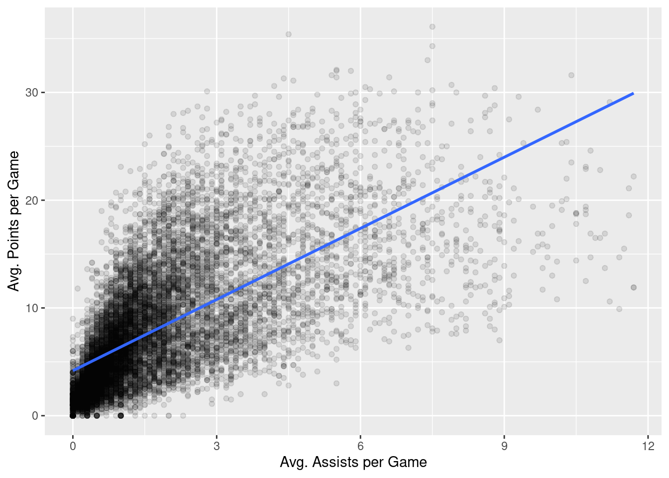
In Chapter 9, we did not discuss how this best-fitting trend line was generated. That is the topic of this chapter.
14.1.1 Simple linear regression
You may recall that the equation of a line is \(y = a + bx\). It is defined by two parameters \(a\) and \(b\). The intercept, \(a\), is the value of \(y\) when \(x = 0\). The slope, \(b\), is the increase in \(y\) for every increase of one in units of \(x\).
When discussing regression, we will often use different notation in which a line is described as \(\widehat{y} = b_0 + b_1 \cdot x\). The intercept is \(b_0\), so \(b_0\) is the value of \(\widehat{y}\) when \(x = 0\). The slope is \(b_1\), i.e., the increase in \(\widehat{y}\) for every increase in one one in \(x\). Why do we put a “hat” on top of the \(y\)? It’s a form of notation commonly used in statistics to indicate that we have an estimate of \(y\) rather than \(y\) itself.
From inspecting the regression line in Figure 15.1, we know that \(b_1\) is positive. Why? Because players who have higher ast values also tend to have higher pts values. However, what is the numerical value of the slope \(b_1\)? What about the intercept \(b_0\)?
We can obtain values of \(b_0\) and \(b_1\) by using linear regression. This is done in two steps:
- We first fit the linear regression model using the
lm()function and save it inresult. - We get the regression table by applying the
get_regression_table()function from themoderndivepackage toscore_model.
# fit the model
model <- lm(pts ~ ast, data = nba)

# get regression table
summary(model)
Call:
lm(formula = pts ~ ast, data = nba)

Residuals:
     Min       1Q   Median       3Q      Max
-19.3727  -2.9604  -0.8805   2.3586  21.3150

Coefficients:
            Estimate Std. Error t value Pr(>|t|)
(Intercept)  4.17998    0.05748   72.72   <2e-16 ***
ast          2.20111    0.02253   97.69   <2e-16 ***
---
Signif. codes:  0 '***' 0.001 '**' 0.01 '*' 0.05 '.' 0.1 ' ' 1

Residual standard error: 4.484 on 12303 degrees of freedom
Multiple R-squared:  0.4369,    Adjusted R-squared:  0.4368
F-statistic:  9544 on 1 and 12303 DF,  p-value: < 2.2e-16
Let’s first focus on interpreting the output, and then we’ll later revisit the code that produced it. In the Estimate column are the estimated values of both the intercept, \(b_0\), and slope, \(b_1\). Thus, the equation of the regression line in Figure Figure 15.1 is:
\[ \begin{aligned} \widehat{y} &= b_0 + b_1 \cdot x\\ \widehat{pts} &= b_0 + b_{ast} \cdot ast\\ &= 4.17998 + 2.20111 \cdot ast \end{aligned} \]
The estimated value of the intercept, \(b_0 = 4.17998\), is the value of pts expected when \(ast=0\). Or in graphical terms, \(b_0 = 4.17998\) indicates where the regression line intersects the \(y\) axis when \(x=0\). Note, that the intercept always has a natural a mathematical interpretation, it may well not have a practical interpretation. For example, if x were ratings from a scale that ran 1-7, observing \(x=0\) would be impossible.
Typically, the slope \(b_1 = b_{ast} = 2.20111\), is of primary interested, as it summarizes the relationship between ast and pts, the two variables we are investigating. Note that the estimate of \(b_1 = b_{ast}\) is positive, suggesting a positive relationship between these two variables, higher ast values seem to imply pts. The other way we might evaluate this relationship would be to calculate a correlation coefficient:
cor(nba$pts, nba$ast)[1] 0.6609489The correlation coefficient and \(b_1 = b_{ast}\) are both positive, but are different values. The correlation coefficient’s interpretation is often the “strength of linear association”. The interpretation of \(b_1 = b_{ast}\) is a little different:
For every increase of 1 unit in
ast, there is an systematic and corresponding increase of 2.20111 units ofpts.
Note that this statement holds on average. But if you take any two players whose ast values differ by exactly 1 assist, we should not expect their pts values to differ by exactly 2.20111. What \(b_1 = b_{ast} = 2.20111\) means is that across all possible players, the average difference in pts between two instructors whose ast values differ by exactly one is 2.20111.
Now that we’ve learned how to compute the equation for the regression line using the estimated values of \(b_0\) and \(b_1\) and how to interpret the resulting estimates, let’s revisit the code that generated these estimates:
# fit the model
model <- lm(pts ~ ast, data = nba)

# get regression table
summary(model)
First, we fit the linear regression model to data (our nba data in this case) using the lm() function and save this as model. When we say “fit”, we mean that we estimate the parameters of our model (\(b_0\) and \(b_1\) using our data). The function lm() constructs our model for us (lm stands for linear model) and is used as follows: lm(y ~ x, data = data_frame_name) where:
yis the target variable, followed by a tilde~. In our case,yis set topts.xis the explanatory variable. In our case,xis set toast.- The combination of
y ~ xis called a model formula. In our case, the model formula ispts ~ ast. Target variables appear on the left hand side of the formula and explanatory variables appear on the right. data_frame_nameis the name of the data frame that contains the variablesyandx. In our case,data_frame_nameis thenbadata frame.
Second, we take the saved model in model and apply the summary() function to obtain a regression table. The summary() function produces four columns: Estimate, Std. Error, t value, and Pr(>|t|). These are the estimated value of each model parameter, the standard error of these estimates, the corresponding \(t\) values, and associated \(p\) values.
14.1.2 Observed values, fitted values, and residuals
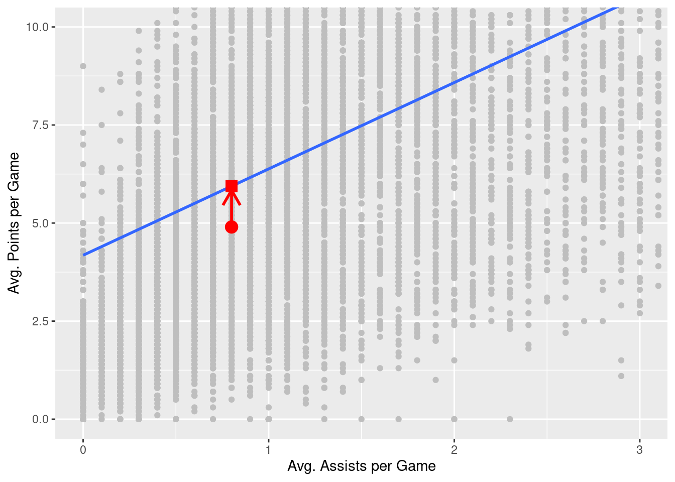
We just saw how to get the value of the intercept and the slope of a regression line from the Estimate column of the regression table generated by the summary() function. Let’s say we instead want information on individual observations. For example, let’s focus on a single player. Specifically, let’s pull out the row of nba that is associated with the Chris Clemons, who appears exactly once in our data set. The corresponding row is illustrated in Table 14.1:
| player_name | pts | ast | season | gp |
|---|---|---|---|---|
| Chris Clemons | 4.9 | 0.8 | 2019-20 | 33 |
What is the value \(\widehat{y}\) on the regression line corresponding to this player’s ast value of 0.8? In Figure 14.2, we mark three values corresponding to the player and the associated statistical terms:
- Circle: The observed value, \(y\) = 4.9, is this course’s instructor’s actual teaching score.
- Square: The fitted value, \(\widehat{y}\), is the value on the regression line that corresponds to \(x\) =
ast= 0.8. This value is computed using the intercept and slope in the previous regression table:
\[\widehat{y} = b_0 + b_1 x = 4.180 + 2.201 \cdot 0.8 = 5.9408753\]
- Arrow: The length of this arrow is the residual and is computed by subtracting the fitted value \(\widehat{y}\) from the observed value \(y\). The residual can be thought of as the error the model generates for a particular observation. In the case of this course’s player, the residual is \(y - \widehat{y}\) = 4.9 - 5.9408753 = -1.0408753.
Now say we want to compute both the fitted value, \(\widehat{y} = b_0 + b_1 x\), and the residual, \(y - \widehat{y}\), for all 12305 rows in our nba data set. We could repeat the previous calculations we performed by hand 12305 times, but that would be somewhat time-consuming. Instead, let’s do this using a computer with the get_regression_points() function. Just like the get_regression_table() function, the get_regression_points() function is a “wrapper” function. However, this function returns a different output. Let’s apply the get_regression_points() function to score_model, which is where we saved our lm() model in the previous section. In Table @ref(tab:regression-points-1) we present the results of only the 21st through 24th courses for brevity’s sake.
model %>%
    # expand model result
    augment() %>%
    # select relevant columns
    select(c("pts", "ast", ".fitted", ".resid")) %>%
    # rename columns
    rename_at(vars(c(".fitted", ".resid")), ~c("pts_hat", "residual"))
# A tibble: 12,305 × 4
pts ast pts_hat residual
<dbl> <dbl> <dbl> <dbl>
1 5.7 3.1 11.0 -5.30
2 2.3 0.3 4.84 -2.54
3 0.8 0.4 5.06 -4.26
4 3.7 0.6 5.50 -1.80
5 2.4 0.2 4.62 -2.22
6 8.2 1 6.38 1.82
7 17.2 3.4 11.7 5.54
8 14.9 1.6 7.70 7.20
9 5.7 1.3 7.04 -1.34
10 6.9 3 10.8 -3.88
# ℹ 12,295 more rowsLet’s inspect the individual columns and match them with the elements of Figure 14.2:
- The
ptscolumn represents the observed outcome variable, \(y\). This column contains the y-position of the 12305 gray data points. - The
astcolumn represents the values of the explanatory variable, \(x\). This is the x-position of the 12305 gray data points. - The
pts_hatcolumn represents the fitted values \(\widehat{y}\). This is the corresponding value on the regression line for the 12305 \(x\) values. - The
residualcolumn represents the residuals \(y - \widehat{y}\). This is the 12305 vertical distances between the 12305 black points and the regression line.
Just as we did for Chris Clemons’ single row from nba, one can now repeat the calculations for any particular data point (row) in the nba data set or, if you so wish, do so for all rows.
In a bit, we’ll talk about how conventional (“ordinary least squares”) regression takes each of these residuals, squares them (so they are all positive), and finds the model parameters (e.g., \(b_0\) and \(b_1\)) that minimize their sum.
14.1.3 Side note about regression diagnostics
The following functions allow you to investigate the results of a regression conducted with lm(). Each takes a fitted model as an argument (e.g., model):
coefficients(m): Model coefficientscoef(m): Same as coefficients(m)confint(m): Confidence intervals for the regression coefficientsdeviance(m): Residual sum of squareseffects(m): Vector of orthogonal effectsfitted(m): Vector of fitted y valuesresiduals(m): Model residualsresid(m): Same as residuals(m)summary(m): Key statistics, such as \(R^2\), the \(F\) statistic, and the residual standard error (\(\sigma\))vcov(m): Variance–covariance matrix of the main parameters
14.2 Metric-Predicted Variable with One Dichotomous Predictor
Let’s take a step back now and consider a somewhat simpler scenario. Imagine two basketball fans are arguing over who is the better player, Stephen Curry or LeBron James. Curry is a fantastic shooter, but James has more offensive tools at his disposal (e.g., he is much larger and physically stronger). How can we use data to help provide some evidence for this debate? One way we can do so is to compare the average points per game scored by each player (i.e., the data in the pts column of our nba data set). Let’s do that.
14.2.1 Exploratory data analysis
Let’s begin with an exploration of the relevant data. We can do this is a couple of different ways (see Chapter 9 for options). For example, we can begin by looking at the data itself.
nba %>%
    filter(player_name %in% c("Stephen Curry", "LeBron James")) %>%
    select(player_name, pts)
# A tibble: 32 × 2
player_name pts
<chr> <dbl>
1 LeBron James 20.9
2 LeBron James 27.2
3 LeBron James 31.4
4 LeBron James 27.3
5 LeBron James 30
6 LeBron James 28.4
7 Stephen Curry 17.5
8 LeBron James 29.7
9 Stephen Curry 18.6
10 LeBron James 26.7
# ℹ 22 more rowsHere, we see the pts column that we are focusing on and the players’ names. There are only a few rows of data here, so viewing the first few rows gives us a decent sense of what the relevant data looks like. If we had a large number of rows or if the rows were ordered in a particular way (e.g., all of Stephen Curry’s rows were grouped before all of LeBron James’ rows), then we might instead wish to view a random sample of rows.
nba %>%
    filter(player_name %in% c("Stephen Curry", "LeBron James")) %>%
    select(player_name, pts) %>%
    sample_n(10)
# A tibble: 10 × 2
player_name pts
<chr> <dbl>
1 Stephen Curry 17.5
2 LeBron James 25.3
3 LeBron James 25.3
4 LeBron James 27.5
5 LeBron James 25.3
6 LeBron James 27.2
7 LeBron James 28.4
8 Stephen Curry 18.6
9 LeBron James 26.7
10 LeBron James 20.9Another way to get a sense of this data is by generating a variety of descriptive statistics.
nba %>%
    filter(player_name %in% c("Stephen Curry", "LeBron James")) %>%
    select(player_name, pts) %>%
    group_by(player_name) %>%
    summarize(
        m = mean(pts),
        sd = sd(pts),
        min = min(pts),
        "%25 Q" = quantile(pts, .25),
        "%50 Q" = quantile(pts, .5),
        "%75 Q" = quantile(pts, .75),
        max = max(pts)
    )
# A tibble: 2 × 8
player_name m sd min `%25 Q` `%50 Q` `%75 Q` max
<chr> <dbl> <dbl> <dbl> <dbl> <dbl> <dbl> <dbl>
1 LeBron James 27.1 2.35 20.9 25.8 27.1 28.0 31.4
2 Stephen Curry 23.8 4.92 14.7 20.8 24 26.4 32 Here, we observe that the LeBron James’ average across seasons is 27.1 whereas Stephen Curry’s average is 23.8. Indeed, James has higher values than Curry at each quantile as well. Let’s visualize the actual distribution that these summary statistics describe:
nba %>%
    filter(player_name %in% c("Stephen Curry", "LeBron James")) %>%
    ggplot(mapping = aes(x = pts, fill = player_name)) +
    geom_histogram(bins = 10, position = "dodge")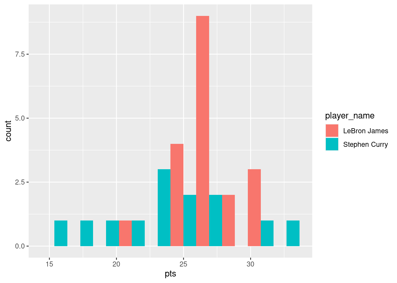
Some people prefer comparing the distributions of a numerical variable between different levels of a categorical variable using a boxplot instead of a faceted histogram. This is because we can make quick comparisons between the categorical variable’s levels with imaginary horizontal lines. This is particularly true when the categorical variable of interest takes on many levels. Let’s take a quick look.
nba %>%
    filter(player_name %in% c("Stephen Curry", "LeBron James")) %>%
    ggplot(aes(x = player_name, y = pts)) +
      geom_boxplot() +
      labs(x = "Player", y = "Avg. Points per Game")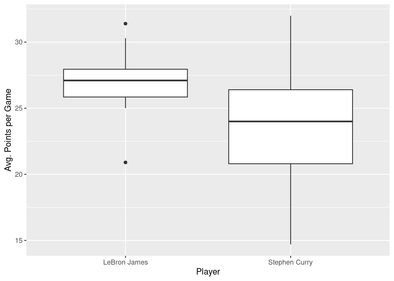
This visualization reiterates that LeBron James’ median (the solid line in the middle of the left box) are greater than Stephen Curry’s, but we can also more easily see that Stephen Curry’s values are more spread out; there is greater variability in Curry’s pts values across seasons.
All of these explorations seem to suggest that LeBron James is a better scorer than Stephen Curry. But we really need some inferential statistics to determine whether the difference between the two players’ means is large enough to convince us to reject the null hypothesis that the two players’ means are equal (and treat LeBron James’ mean as larger than Stephen Curry’s mean).
14.2.2 Linear regression
In Section 14.1.1, we introduced simple linear regression, which involves modeling the relationship between a numerical outcome variable \(y\) and a numerical explanatory variable \(x\). In the current situation, we instead have a categorical explanatory variable player_name. Furthermore, this categorical variable takes on exactly two values (i.e., “LeBron James” and “Stephen Curry”), which means that our explanatory variable is dichotomous.
Before we begin putting our regression model together, let’s grab the relevant data and save into a variable for less verbose code:
curryjames <- nba %>%
    filter(player_name %in% c("Stephen Curry", "LeBron James")) %>%
    select(c(pts, player_name))
Now we can construct the model, fit it to the data, and summarize our results as we did before.
curryjames_model <- lm(pts ~ player_name, data = curryjames)
summary(curryjames_model)
Call:
lm(formula = pts ~ player_name, data = curryjames)

Residuals:
   Min     1Q Median     3Q    Max
-9.062 -1.810  0.064  1.951  8.239

Coefficients:
                         Estimate Std. Error t value Pr(>|t|)
(Intercept)               27.1105     0.8268  32.790   <2e-16 ***
player_nameStephen Curry  -3.3490     1.2972  -2.582    0.015 *
---
Signif. codes:  0 '***' 0.001 '**' 0.01 '*' 0.05 '.' 0.1 ' ' 1

Residual standard error: 3.604 on 30 degrees of freedom
Multiple R-squared:  0.1818,    Adjusted R-squared:  0.1545
F-statistic: 6.665 on 1 and 30 DF,  p-value: 0.01496
We have two rows in our regression table: (Intercept) and player_nameStephen Curry. We specified our model as pts ~ player_name. But what exactly is happening behind the scenes? One way to investigate is to look at the design matrix that lm() has constructed on our behalf:
model.matrix(curryjames_model) (Intercept) player_nameStephen Curry
1 1 0
2 1 0
3 1 0
4 1 0
5 1 0
6 1 0
7 1 1
8 1 0
9 1 1
10 1 0
11 1 1
12 1 0
13 1 1
14 1 0
15 1 1
16 1 0
17 1 0
18 1 1
19 1 0
20 1 1
21 1 1
22 1 0
23 1 1
24 1 0
25 1 1
26 1 0
27 1 0
28 1 1
29 1 0
30 1 1
31 1 1
32 1 0
attr(,"assign")
[1] 0 1
attr(,"contrasts")
attr(,"contrasts")$player_name
[1] "contr.treatment"To better understand how this design matrix encodes our raw data, we can squash to two together for easy comparison:
bind_cols(curryjames, model.matrix(curryjames_model))# A tibble: 32 × 4
pts player_name `(Intercept)` `player_nameStephen Curry`
<dbl> <chr> <dbl> <dbl>
1 20.9 LeBron James 1 0
2 27.2 LeBron James 1 0
3 31.4 LeBron James 1 0
4 27.3 LeBron James 1 0
5 30 LeBron James 1 0
6 28.4 LeBron James 1 0
7 17.5 Stephen Curry 1 1
8 29.7 LeBron James 1 0
9 18.6 Stephen Curry 1 1
10 26.7 LeBron James 1 0
# ℹ 22 more rowsNow we can see that lm() has constructed a design matrix with two columns (one named (Intercept) and one named player_nameStephen Curry). Every value in the intercept column is 1. The values in the player_nameStephen Curry column are 1 where player_name == Stephen Curry and 0 where player_name == LeBron James.
Let’s now write the equation for our fitted values \(\widehat{y} = \widehat{\text{pts}}\):
\[ \begin{aligned} \widehat{y} = \widehat{pts} &= b_0 + b_1\cdot\mathbb{1}_{\text{Curry}}(x) \end{aligned} \]
What is happening here? First, \(\mathbb{1}_{A}(x)\) is what’s known in mathematics as an “indicator function”. It returns only one of two possible values, 0 and 1, where
\[ \mathbb{1}_{A}(x) = \left\{ \begin{array}{ll} 1 & \text{if } x \text{ is in } A \\ 0 & \text{if } \text{otherwise} \end{array} \right. \]
In a statistical modeling context, this is also known as a dummy variable. In our case, the indicator variable \(\mathbb{1}_{\text{Curry}}(x)\) returns 1 if a row of data corresponds to an observation associated with Stephan Curry and 0 otherwise (which is exactly what is in the curry column of our design matrix above):
\[ \mathbb{1}_{\text{Curry}}(x) = \left\{ \begin{array}{ll} 1 & \text{if } \text{player } x \text{ is Stephen Curry} \\ 0 & \text{otherwise}\end{array} \right. \]
Thus, we can consider two different scenarios. The first, is what the model looks like when we are considering observations from LeBron James. At that point, \(\mathbb{1}_{\text{Curry}}(x)=0\), so the model reduces to:
\[ \begin{aligned} \widehat{pts} &= b_0 + b_1\cdot\mathbb{1}_{\text{Curry}}(x) \\ \widehat{pts} &= b_0 + b_1\cdot 0 \\ \widehat{pts} &= b_0 \end{aligned} \]
This suggests that \(b_0\) represents our expectation about the value of pts associated with LeBron James. Now let’s consider what the model looks like when we are considering observations from Stephen Curry. At that point, \(\mathbb{1}_{\text{Curry}}(x)=1\), so the model is:
\[ \begin{aligned} \widehat{pts} &= b_0 + b_1\cdot\mathbb{1}_{\text{Curry}}(x) \\ \widehat{pts} &= b_0 + b_1\cdot 1 \\ \widehat{pts} &= b_0 + b_1 \end{aligned} \]
So what does this suggest about the interpretation of \(b_1\)? Well we already said that \(b_0\) is our expectation about LeBron James’ value of pts. And our expectation about Stephen Curry’s value of pts is \(b+0 + b_1\). This implies that \(b_1\) represents the difference between those two expectations: we expect Stephen Curry’s pts to be \(b_1\) points greater than LeBron James’ pts. You may also think of \(b_1\) as an offset.
So returning to our regression table, we can see that the table indicates that \(b_0=27.1105\) and \(b_1=-3.3490\). So we should expect that LeBron James’ pts values are 27.11 on average. Furthermore, we should expect that Stephen Curry’ pts values should be 3.35 points less than LeBron James’ (less because the coefficient is negative). Let’s compare that to the means of the actual data:
curryjames %>%
    group_by(player_name) %>%
    summarize(mean = mean(pts))
# A tibble: 2 × 2
player_name mean
<chr> <dbl>
1 LeBron James 27.1
2 Stephen Curry 23.8So our coefficient values and the interpretation we described above seem to match.
You might be asking at this point why was LeBron James chosen as the “baseline” and Stephen Curry appears in the model as an offset. This is the case for no other reason than LeBron James appears first in our curryjames data frame. Good question.
It turns out that we have allows the lm() function to do some “bookkeeping” work on our behalf. When we look at our data, we see that the player_name column is <chr>, or a character vector (aka, a string). But we can’t really do math on strings. So what we really need to do is convert these strings into a categorical variable. To do this, we can use R’s factors.
14.2.3 Brief detour about factors
When you have a column that is a character vector (or other data type) and you wish to treat it as a categorical variable, you can use the tidyverse package forcats. One of the core functions in the forcats package is fct(). This function does exactly what we need: converts a vector as a factor or categorical variable. Let’s see what fct() does for our player_name column:
fct(curryjames$player_name) [1] LeBron James LeBron James LeBron James LeBron James LeBron James
[6] LeBron James Stephen Curry LeBron James Stephen Curry LeBron James
[11] Stephen Curry LeBron James Stephen Curry LeBron James Stephen Curry
[16] LeBron James LeBron James Stephen Curry LeBron James Stephen Curry
[21] Stephen Curry LeBron James Stephen Curry LeBron James Stephen Curry
[26] LeBron James LeBron James Stephen Curry LeBron James Stephen Curry
[31] Stephen Curry LeBron James
Levels: LeBron James Stephen CurryIt doesn’t really look like fct() has done too much to our column. The only real addition is the “Levels: LeBron James Stephen Curry” at the bottom. Note that “LeBron James” comes before “Stephen Curry” here. That’s an indication of the order in which the 2 levels exist in the factor. To gain direct control over how player_name is used as a predictor in our regression model, we can create a new column that is a factor version of the player_name column:
curryjames$player_name.f <- fct(curryjames$player_name)Let’s check the levels on this new column:
levels(curryjames$player_name.f)[1] "LeBron James" "Stephen Curry"Note that “LeBron James” comes first here. What were the levels on the original version of the column (i.e., player_name)?
levels(curryjames$player_name)NULLThe original column contains values that are each a character vector (string) and thus there are no “levels”. It was only once we told R that we wanted to treat this column as a factor that fct converted each string into a level on that factor.
Now let’s use this new factor variable as our predictor and see what happens:
summary(lm(pts ~ curryjames$player_name.f, data=curryjames))
Call:
lm(formula = pts ~ curryjames$player_name.f, data = curryjames)

Residuals:
   Min     1Q Median     3Q    Max
-9.062 -1.810  0.064  1.951  8.239

Coefficients:
                                      Estimate Std. Error t value Pr(>|t|)
(Intercept)                            27.1105     0.8268  32.790   <2e-16 ***
curryjames$player_name.fStephen Curry  -3.3490     1.2972  -2.582    0.015 *
---
Signif. codes:  0 '***' 0.001 '**' 0.01 '*' 0.05 '.' 0.1 ' ' 1

Residual standard error: 3.604 on 30 degrees of freedom
Multiple R-squared:  0.1818,    Adjusted R-squared:  0.1545
F-statistic: 6.665 on 1 and 30 DF,  p-value: 0.01496
Other than the slightly more verbose name of our predictor (curryjames$player_name.fStephen Curry), the results are the same. Using another forcats, we can instead construct our player_name factor so that Stephen Curry is used as the baseline:
curryjames$player_name.f <- fct_rev(curryjames$player_name)The fct_rev() function is just like fct(), but it reverses the order of the levels on the factor. Let’s check:
levels(curryjames$player_name.f)[1] "Stephen Curry" "LeBron James" Now let’s use this new factor variable as our predictor and see what happens:
summary(lm(pts ~ curryjames$player_name.f, data=curryjames))
Call:
lm(formula = pts ~ curryjames$player_name.f, data = curryjames)

Residuals:
   Min     1Q Median     3Q    Max
-9.062 -1.810  0.064  1.951  8.239

Coefficients:
                                     Estimate Std. Error t value Pr(>|t|)
(Intercept)                           23.7615     0.9995  23.772   <2e-16 ***
curryjames$player_name.fLeBron James   3.3490     1.2972   2.582    0.015 *
---
Signif. codes:  0 '***' 0.001 '**' 0.01 '*' 0.05 '.' 0.1 ' ' 1

Residual standard error: 3.604 on 30 degrees of freedom
Multiple R-squared:  0.1818,    Adjusted R-squared:  0.1545
F-statistic: 6.665 on 1 and 30 DF,  p-value: 0.01496
Now we can see that our explanatory variable is called curryjames$player_name.fLeBron James, indicating that the level “LeBron James” is acting as the reference.
Let’s generalize this idea a bit. If we fit a linear regression model using a categorical explanatory variable \(x\) that has \(k\) possible categories, the regression table will return an intercept and \(k - 1\) “offsets”. In our case, since there are \(k = 2\) players in our reduced curryjames data set, the regression model returns an intercept corresponding to the baseline for one player and \(k - 1 = 1\) offsets corresponding to the other.
To see this in action (briefly), let’s grab all the rows from nba that contain data from Stephen Curry, LeBron James, or Michael Jordan.
curryjamesjordan <- nba %>%
    filter(player_name %in% c("Stephen Curry",
                              "LeBron James",
                              "Michael Jordan")) %>%
    select(c(pts, player_name))
slice_sample(curryjamesjordan, n=12)
# A tibble: 12 × 2
pts player_name
<dbl> <chr>
1 25.5 Stephen Curry
2 27.3 Stephen Curry
3 25.3 LeBron James
4 14.7 Stephen Curry
5 26.7 LeBron James
6 31.4 LeBron James
7 25.3 Stephen Curry
8 26.4 Stephen Curry
9 22.9 Stephen Curry
10 30.1 Stephen Curry
11 30 LeBron James
12 27.2 LeBron James Now our player_name column contains 3 values instead of 2. Let’s convert the player_name column into a factor as before:
curryjamesjordan$player_name.f <- fct(curryjamesjordan$player_name)Let’s check the levels on this new column:
levels(curryjamesjordan$player_name.f)[1] "Michael Jordan" "LeBron James" "Stephen Curry" If we now run the same model, we get the following output:
curryjamesjordan_model <- lm(pts ~ curryjamesjordan$player_name.f,
                            data = curryjamesjordan)
summary(curryjamesjordan_model)
Call:
lm(formula = pts ~ curryjamesjordan$player_name.f, data = curryjamesjordan)

Residuals:
   Min     1Q Median     3Q    Max
-9.062 -1.810  0.064  2.602  8.239

Coefficients:
                                            Estimate Std. Error t value
(Intercept)                                   25.300      1.854  13.649
curryjamesjordan$player_name.fLeBron James     1.811      2.039   0.888
curryjamesjordan$player_name.fStephen Curry   -1.538      2.120  -0.726
                                            Pr(>|t|)
(Intercept)                                 3.99e-15 ***
curryjamesjordan$player_name.fLeBron James     0.381
curryjamesjordan$player_name.fStephen Curry    0.473
---
Signif. codes:  0 '***' 0.001 '**' 0.01 '*' 0.05 '.' 0.1 ' ' 1

Residual standard error: 3.707 on 33 degrees of freedom
Multiple R-squared:  0.1614,    Adjusted R-squared:  0.1106
F-statistic: 3.176 on 2 and 33 DF,  p-value: 0.05478
We can see that there are now 2 player_name-related explanatory variables listed in our regression table: player_name.fLeBron James and player_name.fStephen Curry. What model.matrix did lm() construct now that we have a categorical variable (player_name.f) with 3 levels? Let’s again combine the model.matrix with the original data:
print(bind_cols(curryjamesjordan,
                model.matrix(curryjamesjordan_model)),
      width = Inf)
# A tibble: 36 × 6
pts player_name player_name.f `(Intercept)`
<dbl> <chr> <fct> <dbl>
1 29.6 Michael Jordan Michael Jordan 1
2 28.7 Michael Jordan Michael Jordan 1
3 22.9 Michael Jordan Michael Jordan 1
4 20 Michael Jordan Michael Jordan 1
5 20.9 LeBron James LeBron James 1
6 27.2 LeBron James LeBron James 1
7 31.4 LeBron James LeBron James 1
8 27.3 LeBron James LeBron James 1
9 30 LeBron James LeBron James 1
10 28.4 LeBron James LeBron James 1
`curryjamesjordan$player_name.fLeBron James`
<dbl>
1 0
2 0
3 0
4 0
5 1
6 1
7 1
8 1
9 1
10 1
`curryjamesjordan$player_name.fStephen Curry`
<dbl>
1 0
2 0
3 0
4 0
5 0
6 0
7 0
8 0
9 0
10 0
# ℹ 26 more rowsHere we can see that there are three columns in our model.matrix. The first is the intercept and every value is \(1\). The next column is curryjamesjordan$player_name.fLeBron James and takes on a value of \(1\) when the row corresponds to a row of data associated with LeBron James and \(0\) otherwise. The final column is curryjamesjordan$player_name.fStephen Curry and takes on a value of \(1\) when the row corresponds to a row of data associated with Stephan Curry and \(0\) otherwise.
With a little consideration (and possibly a bit of algebra), you may be able to convince yourself that our two explanatory variables work much as they did when we only had two levels on the player_name factor. Our Intercept represents our expectation about the value of pts associated with Michael Jordan, player_name.fLeBron James represents our expectation about the difference between Michael Jordan’s value of pts and LeBron James’ value of pts, and player_name.fStephan Curry represents our expectation about the difference between Michael Jordan’s value of pts and Stephan Curry’s value of pts.
14.2.4 An even briefer detour about contrasts
An additional option is to specify contrasts. Contrasts specify how lm() uses our factor(s) to construct the model.matrix that contains the actual, numeric values as the observed values of our explanatory variables, \(X\). When working with the curryjame data set, we saw that model.matrix was created such that there was an Intercept column and a second column that coded for the identity of the player (either Curry or James). We also saw that we could flexibly control which player was coded as a \(0\) and which was coded as a \(1\). The idea that one level of our factor plays the role of reference and is coded as \(0\) whereas the other level (or other levels) are each coded as \(1\) and the \(\beta\) values represents differences from the reference level is only one way to construct the model.matrix. This specific approach is sometimes referred to as treatment coding or dummy coding. But other options exist!
First, let’s see how we can inspect (and control) the numeric coding of our factor’s levels. Let’s first do this for the simpler case with only two players.
contrasts(curryjames$player_name.f) LeBron James
Stephen Curry 0
LeBron James 1Here we can see that the raw materials used to construct the model.matrix. The Stephen Curry column here indicates that the model.matrix will place a \(1\) in every row where player_name=="Stephen Curry" and a \(0\) otherwise. This is exactly what we saw when we inspected the model.matrix and gives rise to the interpretation of \(\beta\) we outlined above. But what if we want different numeric values?
To quickly construct different contrasts, we can use a family of functions that includes contr.treatment(), which generates the treatment/dummy coding seen above. We have two levels of our player_name factor, so the default contrast is:
contr.treatment(2) 2
1 0
2 1Other coding schemes include contr.sum() which is sometimes called “sum coding” and sometimes referred to as “effects coding”.
contr.sum(2) [,1]
1 1
2 -1If we use sum coding on our player_name factor, we should get a column in our model.matrix that has a \(-1\) in each row of data associated with LeBron James and a \(1\) in every row of data associated with Stephen Curry. Let’s see how using sum coding changes our regression output:
contrasts(curryjames$player_name.f) <- contr.sum(2)
tidy(lm(pts ~ curryjames$player_name.f, data = curryjames))
# A tibble: 2 × 5
term estimate std.error statistic p.value
<chr> <dbl> <dbl> <dbl> <dbl>
1 (Intercept) 25.4 0.649 39.2 2.46e-27
2 curryjames$player_name.f1 -1.67 0.649 -2.58 1.50e- 2Now we have a row for our intercept (as before) and a row called curryjames$player_name.f1. Given our coding, I assert that the intercept estimate now represents the “grand mean” of the two players’ pts values (e.g., (James’ average + Curry’s average) / 2, which may be different than the mean value of pts if we have different numbers of observations from James and Curry!) and that player_name.f1 represents the difference between the LeBron James’ pts value and this grand mean. I will leave it as an exercise for the reader to verify this.
Other coding schemes are available, including “difference” or “contrast” coding, Helmert coding, polynomial coding, and those that replicate ANOVA. As a starting point, I would recommend the help page associate with the contrasts() function (i.e., help contrasts).
14.3 Conclusion
Understanding a regression table output when you’re using a categorical explanatory variable is a topic those new to regression often struggle with. The only real remedy for these struggles is practice, practice, practice. However, once you equip yourselves with an understanding of how to create regression models using categorical explanatory variables, you’ll be able to incorporate many new variables into your models, given the large amount of the world’s data that is categorical.
14.4 Activities
- Generate 200 random values drawn from a normal distribution with a mean of \(2.0\) and a standard deviation of \(8.0\). Save these values to a variable named
x. - Generate 200 random values drawn from a normal distribution with a mean of \(50.0\) and a standard deviation of \(12.0\). Save these values to a variable named
y1. - Create a data frame (a tibble) with two columns, one with all the values from
y1and one with all the values fromx. - Conduct a regression, using the
xcolumn as the explanatory variable and they1column as the outcome variable. - Inspect the estimated model parameters. What do they suggest about the relationship between
xandy1? - Add a new column to your data frame and name it
y2. The values ofy2should be equal to \(14 + 4.3x\). - Conduct a second regression, again using the
xcolumn as the explanatory variable, but now using they2column as the outcome variable. - Inspect the estimated model parameters. What do they suggest about the relationship between
xandy2? - Add a new column to your data frame and name it
y3. The values ofy3should be equal to the values in they2, but each of the 200 values iny2should have a random value added to it. This random value should be drawn from a normal distribution with a mean of \(0.0\) and a standard deviation of \(5.0\). - Conduct a third regression, again using the
xcolumn as the explanatory variable, but now using they3column as the outcome variable. - Inspect the estimated model parameters. What do they suggest about the relationship between
xandy3?