nba %>%
    ggplot(aes(x = ast, y = pts)) +
    geom_point(alpha = 0.1) +
    labs(x = "Avg. Assists per Game",
       y = "Avg. Points per Game") +
    geom_smooth(method = "lm", se = FALSE)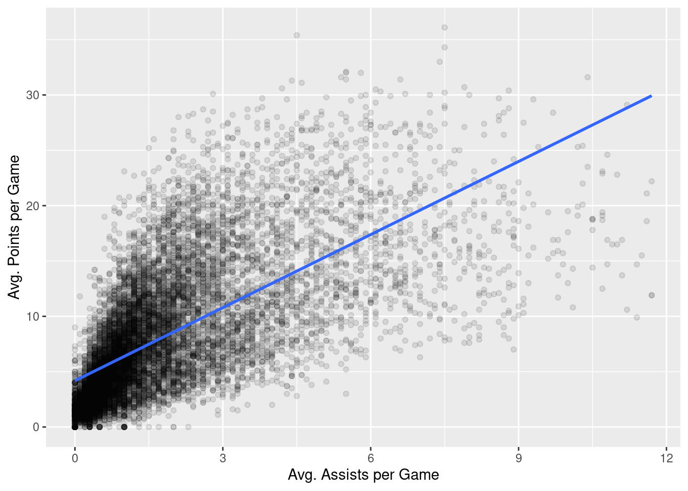
This chapter is intended to illustrate the concepts behind various regression diagnostics. For quantitative “tests” of various model assumptions, you should check out packages such as car, broom, lmtest, lindia, etc. However, much of the functionality found in these packages directly corresponds to the explorations described below.
When we used our basic regression model in Chapter 14, we did so without describing any of the assumptions that underlie the whole endeavor. As we saw, we modeled some outcome variable, \(y\), as a linear function of a second, explanatory variable, \(x\).
\[ \widehat{y} = b_0 + b_1 \cdot x \tag{15.1}\]
The parameter \(b_1\) modifies the explanatory variable, \(x\), multiplicatively. We further saw that the intercept, \(b_0\) can be thought of as modifying an implicit explanatory variable that is simply a vector of ones (a vector with as many entries in it as there are entries in \(x\) and \(y\)).
The reason \(y\) has an “hat” on it in Equation 15.1 is that \(y\) will not, in general, equal \(b_0 + b_1 \cdot x\). Instead, \(b_0 + b_1 \cdot x\) simply provides an estimate of \(y\). So, another way to write Equation 15.1 is:
\[ y = b_0 + b_1 \cdot x + \epsilon \tag{15.2}\]
In Equation 15.2, we can now see more clearly how \(y\) is related to \(x\). Specifically, we see that \(y\) is a noisy version of the line described by \(b_0 + b_1 \cdot x\). The noise, \(\epsilon\), is where most of the important assumptions reside, so it is worth using the notation in Equation 15.2 because it makes the assumptions a bit more explicit.
Before working through some of the assumptions, let’s first remind ourselves of the question we were investigating in Chapter 14. We wished to investigate the extent to which the pts values were a function of the ast values. Let’s look at the scatter plot again
nba %>%
ggplot(aes(x = ast, y = pts)) +
geom_point(alpha = 0.1) +
labs(x = "Avg. Assists per Game",
y = "Avg. Points per Game") +
geom_smooth(method = "lm", se = FALSE)
We then fit a basic regression model:
# fit the model
model <- lm(pts ~ ast, data = nba)

# get regression table
summary(model)
Call:
lm(formula = pts ~ ast, data = nba)

Residuals:
     Min       1Q   Median       3Q      Max
-19.3727  -2.9604  -0.8805   2.3586  21.3150

Coefficients:
            Estimate Std. Error t value Pr(>|t|)
(Intercept)  4.17998    0.05748   72.72   <2e-16 ***
ast          2.20111    0.02253   97.69   <2e-16 ***
---
Signif. codes:  0 '***' 0.001 '**' 0.01 '*' 0.05 '.' 0.1 ' ' 1

Residual standard error: 4.484 on 12303 degrees of freedom
Multiple R-squared:  0.4369,    Adjusted R-squared:  0.4368
F-statistic:  9544 on 1 and 12303 DF,  p-value: < 2.2e-16
With these in place, let’s investigate some of the assumptions underlying this analysis.
By construction, the values of \(\widehat{y}\) are assumed to be a linear function of \(x\). As a corollary of this assumption, \(\epsilon\) is assumed to have a mean of zero for all values of \(x\), \(\mathbb{E}(\epsilon|x)=0\).
How might we investigate the linearity assumption? Well, one way is the plot the residuals against \(\widehat{y}\) and see if the mean of the residuals is in fact zero for all values of \(x\). Let’s do that.
nba %>%
    mutate(ast = ast,
           res = residuals(model)) %>%
    ggplot(aes(ast, res)) +
    geom_point() +
    geom_hline(yintercept = 0, color = "red") +
    geom_smooth()
`geom_smooth()` using method = 'gam' and formula = 'y ~ s(x, bs = "cs")'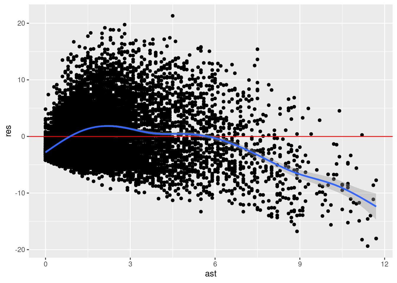
We can see here that the blue line representing the smoothed version of our residuals does not seem to be zero for all values of \(x\) (ast here). It is less than zero for small values of ast, greater than zero for moderate values of ast, and then much less than zero for large values of ast. This suggest that there maybe some non-linearity in the relationship between pts and ast.
Once you have more than one explanatory variable in your regression model, it is often more convenient to inspect the relationship between your residuals and \(\widehat{y}\). So we can do that instead:
nba %>%
    mutate(yhat = fitted(model),
           res = residuals(model)) %>%
    ggplot(aes(yhat, res)) +
    geom_point() +
    geom_hline(yintercept = 0, color = "red") +
    geom_smooth()
`geom_smooth()` using method = 'gam' and formula = 'y ~ s(x, bs = "cs")'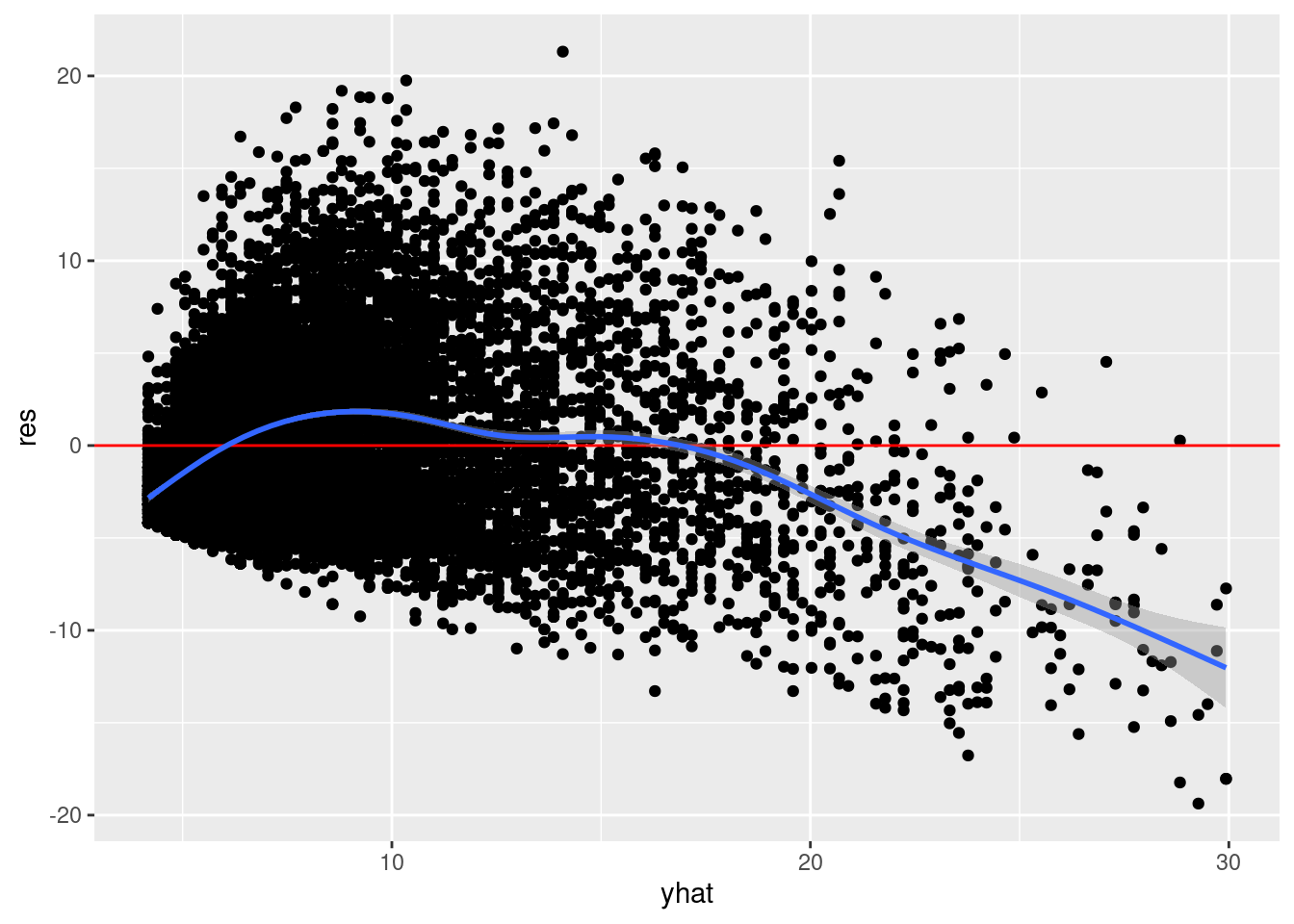
A similar pattern can be seen here. In general, these two approaches will not produce the same results. The former is more conceptually clearer (I think), but really only diagnostic when the model has a single explanatory predictor.
What should we do if we think we may have violations of the linearity assumption? One obvious explanation might be that you are missing informative explanatory variables. A less obvious explanation might be that you don’t actually agree with the linearity assumption. We’ll see how to model non-linear associations later on.
The error term, \(\epsilon\) is assumed to normally distributed. Normal distributions are often described as “bell-shaped” or are described as unimodal, symmetric distributions. But there are very rigorous specifications of what is and is not a normal distribution. Often it can be difficult to distinguish between a normal distribution and something that is “normal-ish”.
Given this difficulty, how might we investigate the normality assumption? A standard way of doing so is to create a so-called quantile-quantile plot (or Q-Q plot). A Q-Q plot is a visualization in which each data point corresponds to the value of one of our residuals and the value of that residual expected if the set of residuals was truly normally-distributed. Let’s do that.
mu <- mean(residuals(model))
sd <- sd(residuals(model))
x <- rnorm(10, mu, sd)

# sort x values
quantiles_obs <- sort(residuals(model))

# theoretical distribution
quantiles_theoretical <- qnorm(ppoints(NROW(residuals(model))), mu, sd)

# quantile-quantile plot
tibble(quantiles_obs = quantiles_obs,
       quantiles_theoretical = quantiles_theoretical) %>%
    ggplot(mapping = aes(quantiles_theoretical, quantiles_obs)) +
    geom_point() +
    geom_abline(color = "red") +
    coord_fixed()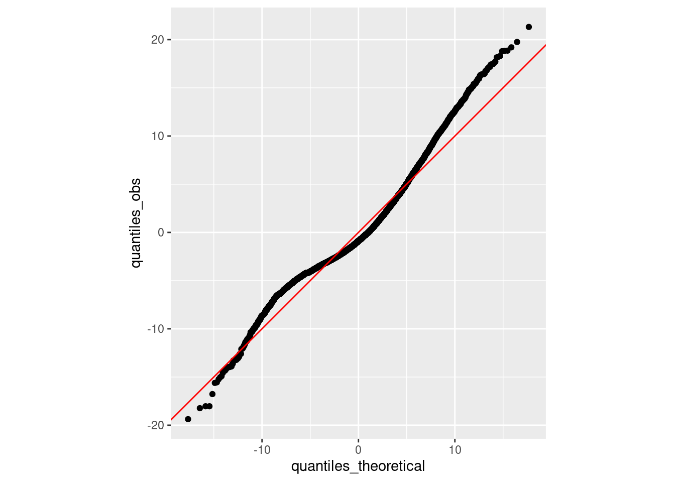
Overall, this is looking pretty good. The observed quantiles lie very close to the quantiles expected if our distribution was truly normal. The right tail appears to be a bit shifted (the observed quantiles are greater than the theoretical quantiles), suggesting a bit of right skew. But again, it’s a reasonably consistent overall.
Not only is the error term, \(\epsilon\) assumed to normally distributed, the variance (or standard deviation) it is assumed to be conditionally independent of \(x\). What does this mean? It means that our observations may be close to our regression line (suggesting that the variance of \(\epsilon\) is small) or our observations might be far from our regression line (suggesting that the variance of \(\epsilon\) is large). But our regression analyses assume that the variance does not vary with \(x\). We assume homoscedasticity. If our data is heteroscedastic, we have violated one of the assumptions of our analytic approach.
How might we investigate the homoscedasticity assumption? One way is to construct a scale-location plot. To do so, you first flip all the residuals so that they are “in the same direction” by taking the absolute value and then taking the square root. You then assess whether the mean of these (now positive) residuals seem to vary with our explanatory variable \(x\). Let’s do that.
nba %>%
    mutate(
        res_sqrt = sqrt(abs(rstandard(model)))
    ) %>%
    ggplot(aes(ast, res_sqrt)) +
    geom_point() +
    geom_smooth()
`geom_smooth()` using method = 'gam' and formula = 'y ~ s(x, bs = "cs")'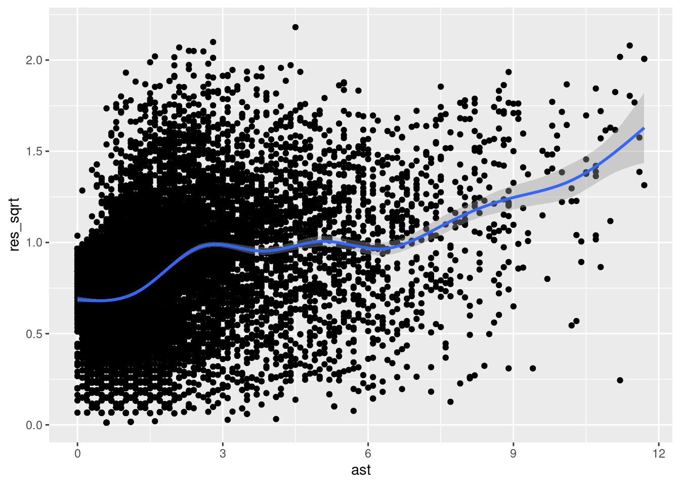
As we can see, the residuals are a bit all over the place. To the left of the plot, we can see that \(\sqrt{|\epsilon|}\) is near 0.75 and it gradually increases as we move to the right (i.e., as \(x\) increases), eventually reaching a value of nearly 1.75. This suggests that our residuals are growing in absolute value as \(x\) increases. Thus, our error appears to be heteroscedastic, violating the assumption of homoscedasticity.
As with the Q-Q plots we looked at above, once you have more than one explanatory variable in your regression model, it is often more convenient to inspect the relationship between your absolute/square root-transformed residuals and \(\widehat{y}\) (instead of \(x\)). So we can do that instead:
nba %>%
    mutate(
        yhat = fitted(model),
        res_sqrt = sqrt(abs(rstandard(model)))
    ) %>%
    ggplot(aes(yhat, res_sqrt)) +
    geom_point() +
    geom_smooth()
There are other diagnostics that are commonly used to detect incompatibilities between your data and your model. These are not really assumptions in the same sense as those described above (or at least I wouldn’t say so). But they are, nonetheless, things that might indicate model misspecification or other issues.
Outliers are often described (or defined) as those that line in the tails of some empirical distribution. In the context of regression, we might be particularly concerned about observations that exert a disproportionate amount of influence on the model fit. There are a variety of quantities that can be computed to assess influence. These include leverage (e.g., hatvalues()) which capture the degree to which a given observation’s \(x\) value is far from other observations’ \(x\) values. Let’s visualize leverage against the standardized version of our residuals.
nba %>%
    mutate(
        standard_res = rstandard(model),
        leverage = hatvalues(model)
    ) %>%
    ggplot(aes(leverage, standard_res)) +
    geom_point() +
    geom_smooth()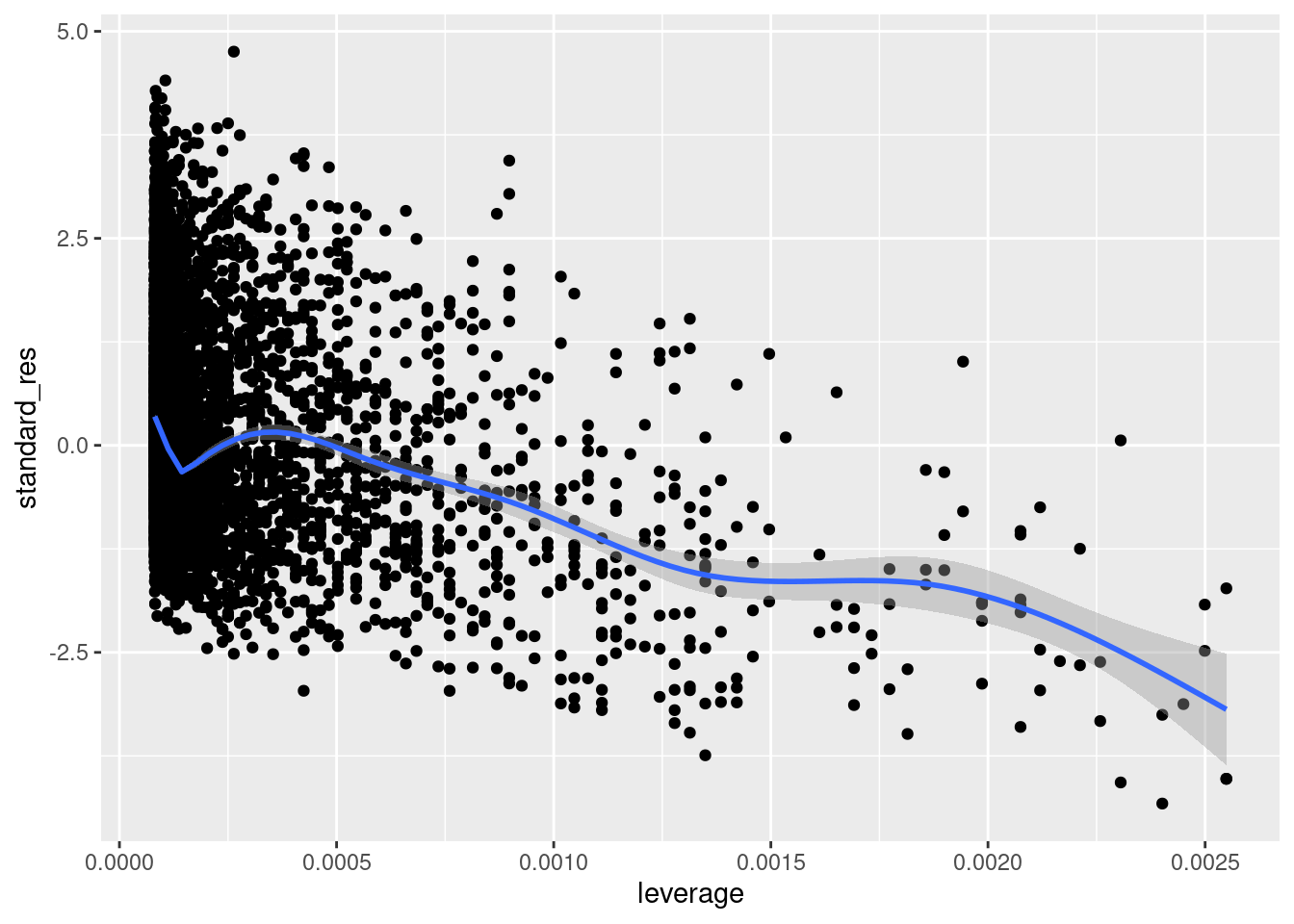
We can see that there are some higher leverage observations that have some pretty small (negative) residuals. Given what we saw above, these are likely the high-ast players; players who had pts values that fall below the regression line.
Another quantitie is DFFITS (e.g., dffits()), which is a combination of an observation’s leverage and the magnitude of its residual. Let’s plot DFFITS.
nba %>%
    mutate(
        dffits = dffits(model),
        obs_number = row_number(),
        large = ifelse(abs(dffits) > 2 * sqrt(length(coef(
            model
        )) / nobs(model)),
        "red", "black")
    ) %>%
    ggplot(aes(obs_number, dffits, color = large)) +
    geom_point() +
    geom_hline(yintercept = c(-1, 1) * 2 * sqrt(length(coef(model)) / nobs(model)),
               color = "red") +
    scale_color_identity()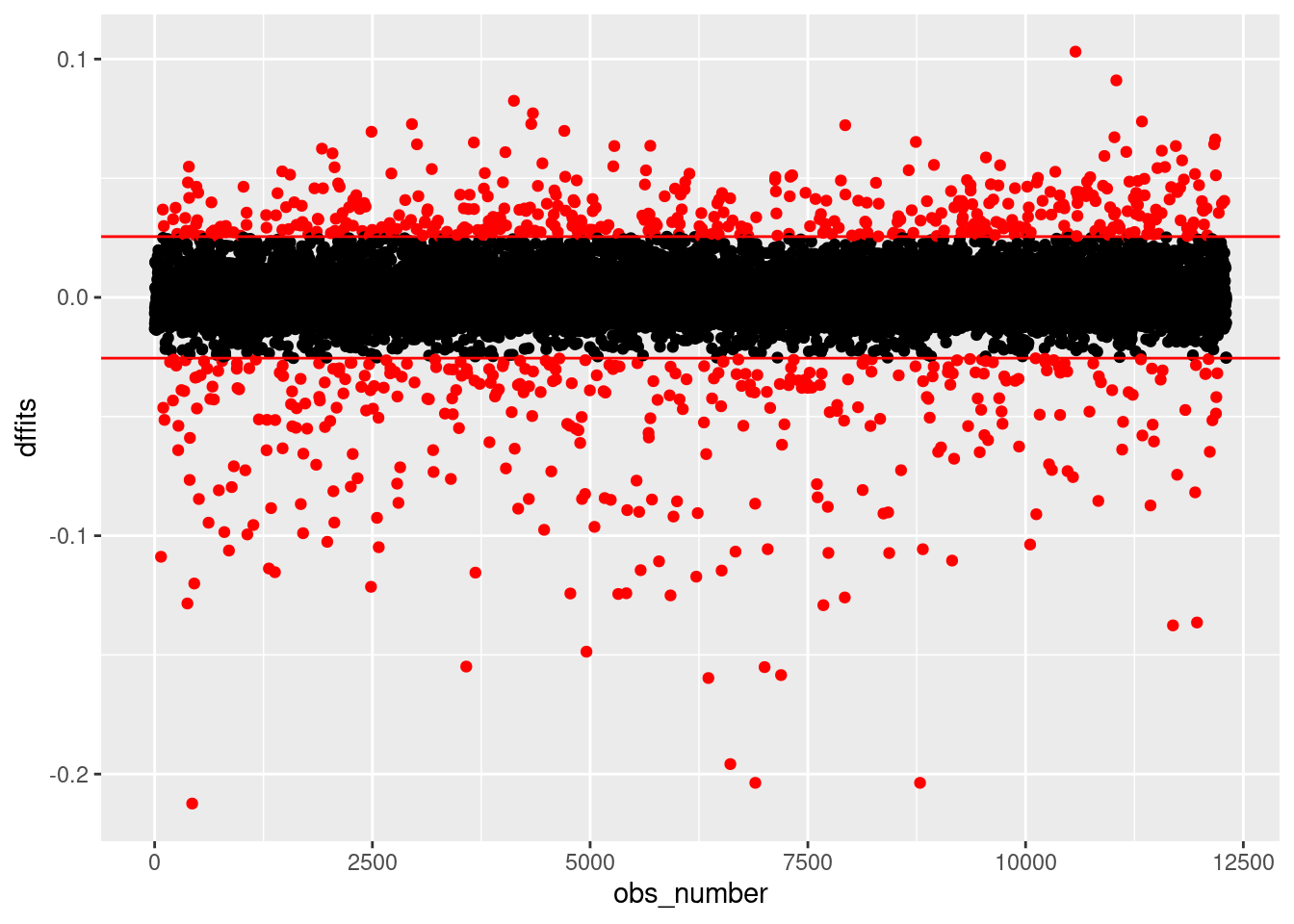
Here, we have color-coded the observations according to a standard heuristic cutoff value (\(\pm 2\sqrt{\frac{k}{n}}\), where \(k\) is the number of predictors in your regression, including your intercept, and \(n\) is the number of observations). As we can see, we have a very large number of observations with values outside the thresholds. But it seems odd to talk about such a large number of observations as being “outliers” that are unduly influencing our results. Nonetheless, this may indicate other problems (such as those we noted above).
Multicollinearity (or just collinearity) refers to dependence among explanatory variables. For this reason, it is only applicable once you have multiple explanatory variables. Collinearity inflates the standard errors associated with parameter estimates which is a concern if you wish to interpret your estimates (e.g., check to see if they are statistically significant). The standard quantity used to assess collinearity is the variance inflation factor (VIF), which you can compute by regression a given explanatory variable on all other explanatory variables, and calculating \(\frac{1}{1-R^2}\) with the model’s resulting \(R\) value. That being said, collinearity is not an issue if you are using regression for the purposes of prediction (i.e., you aren’t interested in inspecting/interpreting model parameters/coefficients).
df value (degrees of freedom) of \(5\). Multiply all \(N\) values by 10. Now add 11 to all \(N\) values.rate parameter of 2.